While trading on the forex market I had opportunity to test a dozen of indicators offered by the MT4 platform, which I one by one eliminated from my charts to finally find out that the vast majority of these tools actually bother me more than helps. Excess information that indicators provide, often conflicting, cause uncertainty, frustration and opening orders under the influence of bad emotions, and in fact, everything that is needed to predict price movements gives us observing the price movement.
However, there are two tools that I still use, because in some circumstances they are very helpful. Before we decide to open an order, we seek additional confirmation that our analysis of the situation is correct. When the conclusions resulting from the observation of the price behaviour additionally are supported by correct interpretation of what the indicator shows us – we have in some sense a confluence allowing us to make a successful trading decision.
The indicators with which I did not part with and they accompany me on a daily basis in trading are Exponential Moving Average (EMA) and MACD, which in principle is also based on the analysis of moving averages.
How I use EMA in my trading I described in the article: “Trading based on the exponential average EMA 144”, and how I use MACD I will describe in today’s art.
Trading using MACD
The MACD indicator [Moving Average Convergence / Divergence] – was constructed by analyst Gerard Appel in 1979. The indicator examines the convergence and divergence of moving averages. It is the difference between long-term value and short-term exponential average. It belongs to the group of oscillators.
There are many strategies based on this indicator, it has multiple uses not only on the forex market, it is also used in speculation on stock exchanges. It is often one of the components of the EA used in algotrading. The most common MACD settings are as follows:
– in the indicator window, we have a histogram (bar graph) MACD where the dotted line is a signalling line, and medium periods are (12,26,9)
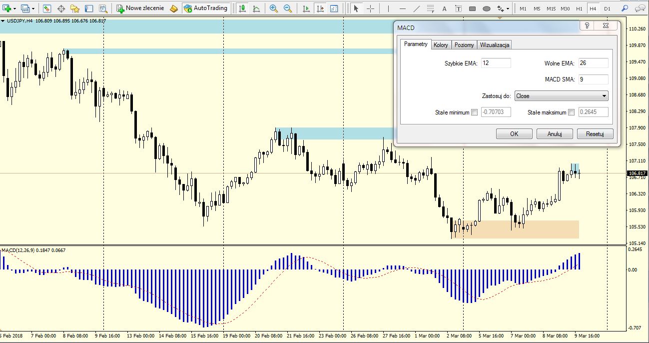
I use a slightly modified indicator in trading:
- parameters (periods of averages) are respectively (12,26,1)
- the colour of the next “bar” of the histogram changes to red when MACD decreases and to blue when the indicator grows.
Below is a sketch of the modified MACD chart:
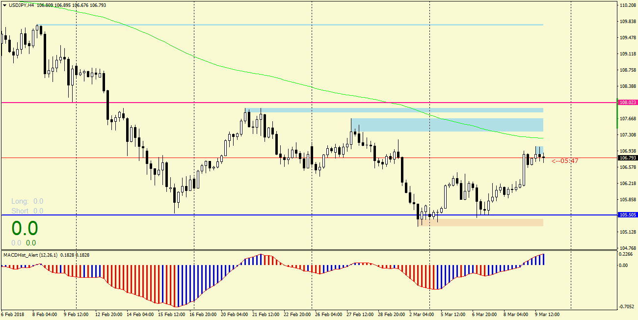
But not always MACD is a good indicator. Don’t rely on it when choppy or low value as on the picture:

What does the MACD tell me?
The basic question we ask ourselves when trading on the forex market is – will a given financial instrument grow or will it fall …? and basically the answer to this question is all we need. MACD in some situations can help us find this answer.
Below are two ways I use this oscillator
I. Divergence
When the value of the indicator moves in the opposite direction to the price, we say that there was divergence. In the chart below, it is very easy to notice. There are two divergences – bullish (upward) and bearish (downward).
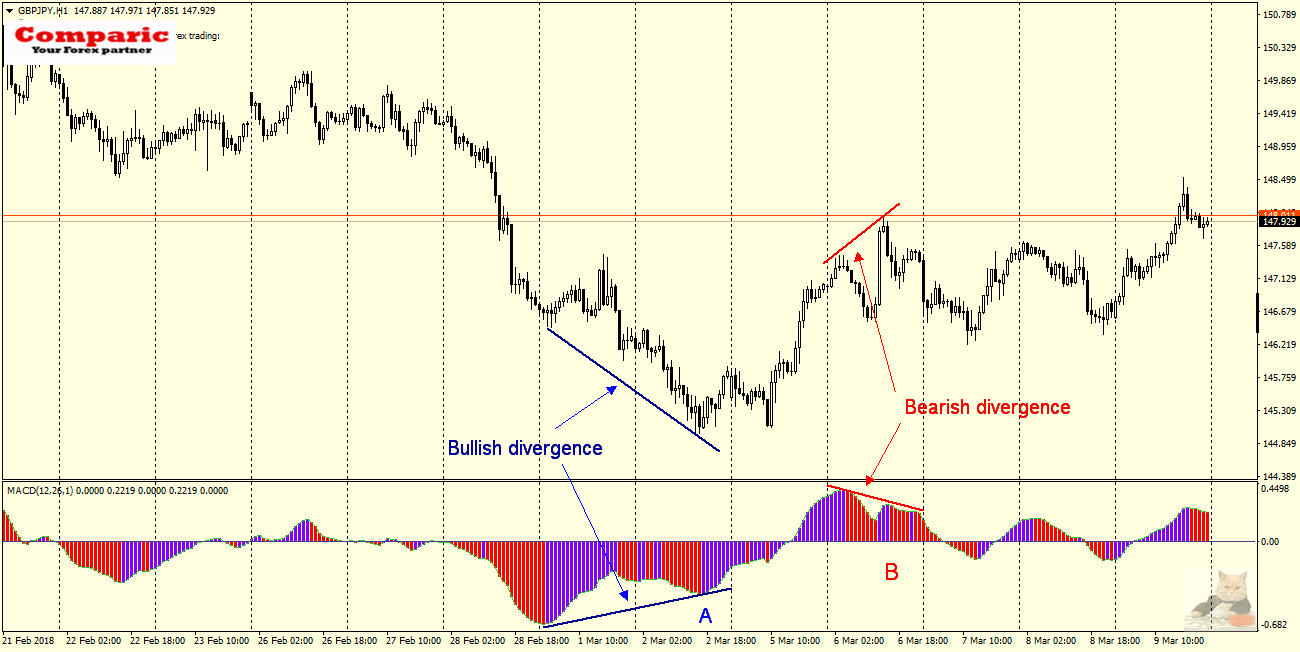
In the first case, when the MACD begins to grow (point A), it heralds a change in the upward trend. In the second when the indicator starts to decrease (B) the trend changes to a downward trend.
Using the indicator in this way, we have a good chance to correctly predict whether the price will rise or fall in the near future. Of course, you should look for further confirmation in the price behaviour, the probability of the event will increase if divergences occur at important levels of support or resistance and (or) are supported by some Price Action formation like Inside, Outside Bars, PinBars or H&S.
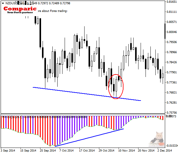 The example chart of NZDUSD Daily presents just such a situation, where the upward divergence is supported by the bullish formation of Price Action -Outside Bar (circled in red), the so-called Bullish Engulfing (the description of this formation can be found here). So we have a double confirmation that there may be a change in the trend. In this case, the move was significant because during the six sessions it gave nearly 300 pips.
Something for beginners …
Experienced traders will notice divergences on the charts without any problem, however, for the less-experienced ones, the following picture showing in a schematic way all the common types of divergence between the price graph and the MACD histogram can be useful.
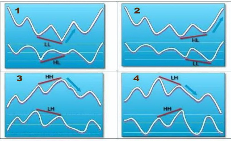 1 and 2 – “bullish divergences” heralding increases, 3.4 – divergences “bears” announcing declines
II. Maximum and minimum – a signal to change the trend?
And how to use the MACD, when there is no divergence and do not promise to be in the near future, and the answer to the question down or up very desirable …? Also here MACD can show us the direction, but in this case, we will focus on its “highs” and “lows”. The easiest way to show it is in the following example:
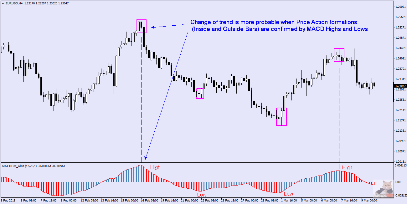
 Observing the chart USDJPY H4 we can see a certain regularity. When the MACD reaches the minimum (1) as evidenced by the change of colour from red to blue visible in the histogram, the next candle after that which caused the change in the colour of the indicator is also bullish as well as few next. The declines begin only when the MACD has reached the maximum (2) as evidenced by the change of the histogram bar to red. The situation with price and MACD is similar in 3,4,5
As I mentioned earlier, if such a maximum or minimum occurs when the price reaches an important level – the probability of a change in the direction in which the price will go, increases significantly, and the move may have a large range. In the case of (1) and (2) we have confirmation of the Price Action – Inside Bar formations, and in the case of (4) and (5) Outside Bar and increases or decreases after breaking out from them. From my experience, this way of determining the trend change (these are usually local, short-term changes) gives the best results at higher time intervals – H4 and D1.
Example of strategy based on PA + MACD:
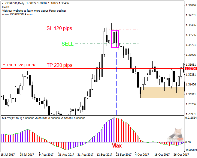
 We search on a chart (H4, D1) of any currency pair or other financial instrument situation where the MACD changed direction -for example – began to decrease, the first red bar appeared on the histogram, ie the maximum was created.
- If the Formation Inside (IB) or Outside Bar (OB) appears, the probability of changing the trend becomes high
- We calculate the size of SL, which should be above the “mother” candle, i.e. forming IB or OB. If it is acceptable to us and the nearest support level is so far away that the risk/reward ratio is favourable, we open the SELL order.
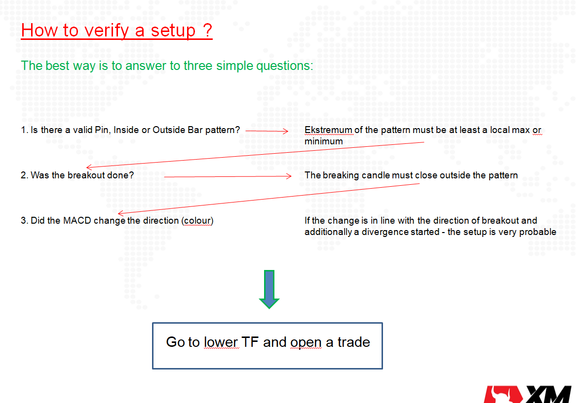
You can use a check list to confirm if the setup is worth trading. The check list contains three simple, very objective questions. If you can answer 3 x Yes – it is a good signal to open the trade.
Dargo, 04.06.2018
 If you feel that you need assistance and more practical knowledge, if you are interested in this strategy and would like to learn more about it and test it on the real market, join our group on Facebook (https://www.facebook.com/groups/328412937935363/ ) where you can take advantage of current daily analyses and order an additional training course. Daily “fresh” trading ideas here: https://t.me/TradewithDargo
Dargo, 24/07/2024


 Review")